Inspired by Uber's Dashboard
KPIs
Workflow
Overhead
Git
18
See how your team performs on Uber's engineering dashboard metrics.

This report was inspired by Uber's engineering metrics dashboard, described in detail in this post from The Pragmatic Engineer.
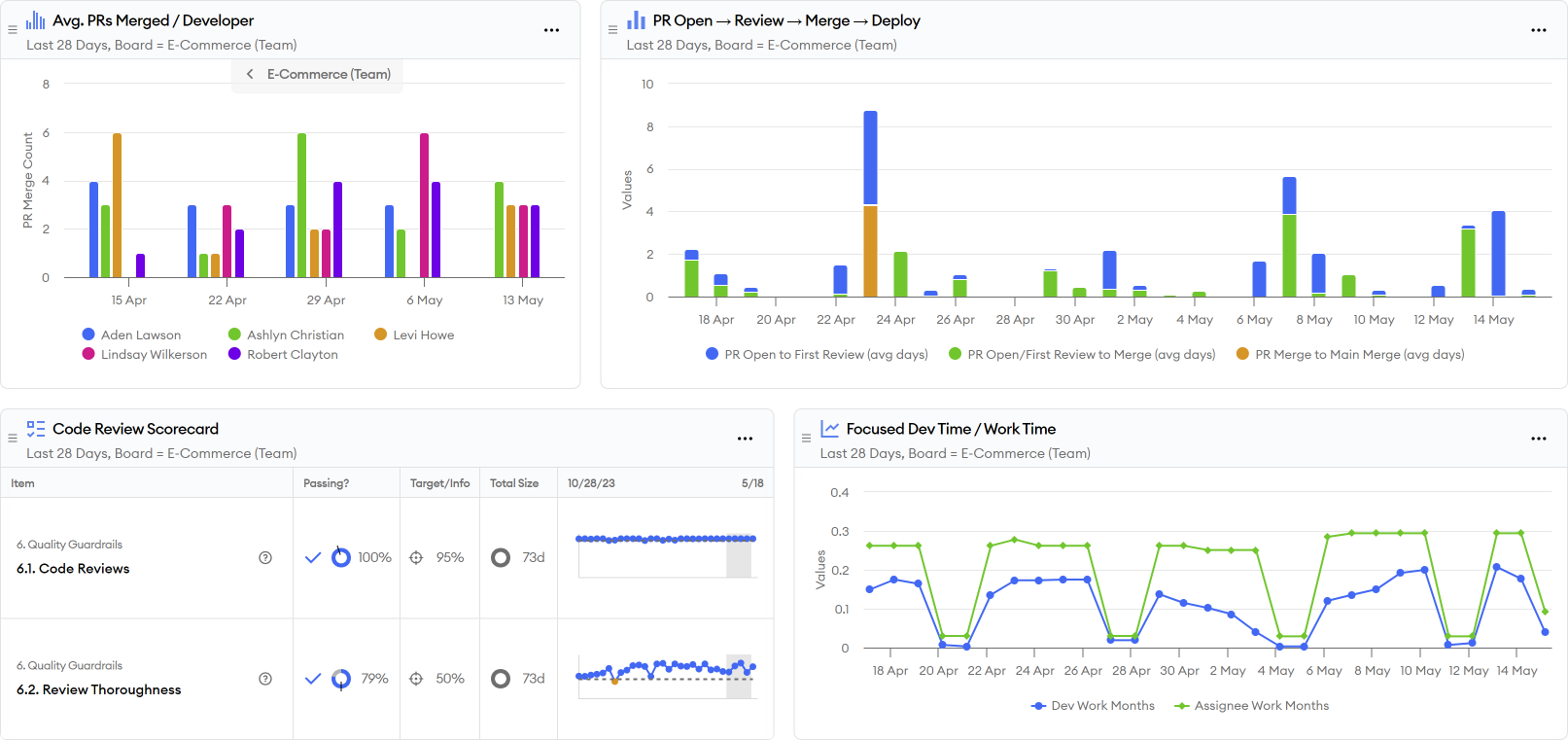
The five metrics covered in this dashboard include:
- Number of pull requests merged per developer
- Time from PR open to review to merge (Uber's dashboard only shows from open to merge, but we find it helpful to have a more granular breakdown.)
- Code review thoroughness (Uber's dashboard only shows review count per engineer, but we believe the more important number is ratio of pull requests have a review and where the review is thorough.)
- Active coding time per engineer compared to all work time (described as focus time per engineer in Uber's dashboard)
- Time from PR merge to launch (included next to the PR open to review to merge metrics)