Custom Report Builder
The custom report builder is the core component of minware’s Development Work Intelligence Platform. It offers the power of a business intelligence tool like Tableau for your development data with a simple point-and-click interface.
It lets you quickly create custom charts and tables that combine data from all of your development tools, including version control (GitHub, GitLab, Bitbucket, Azure DevOps), ticketing (Jira, GitHub Issues) and more.
Getting Started
You can view the custom report building by clicking on “Custom Report” in the main navigation menu.
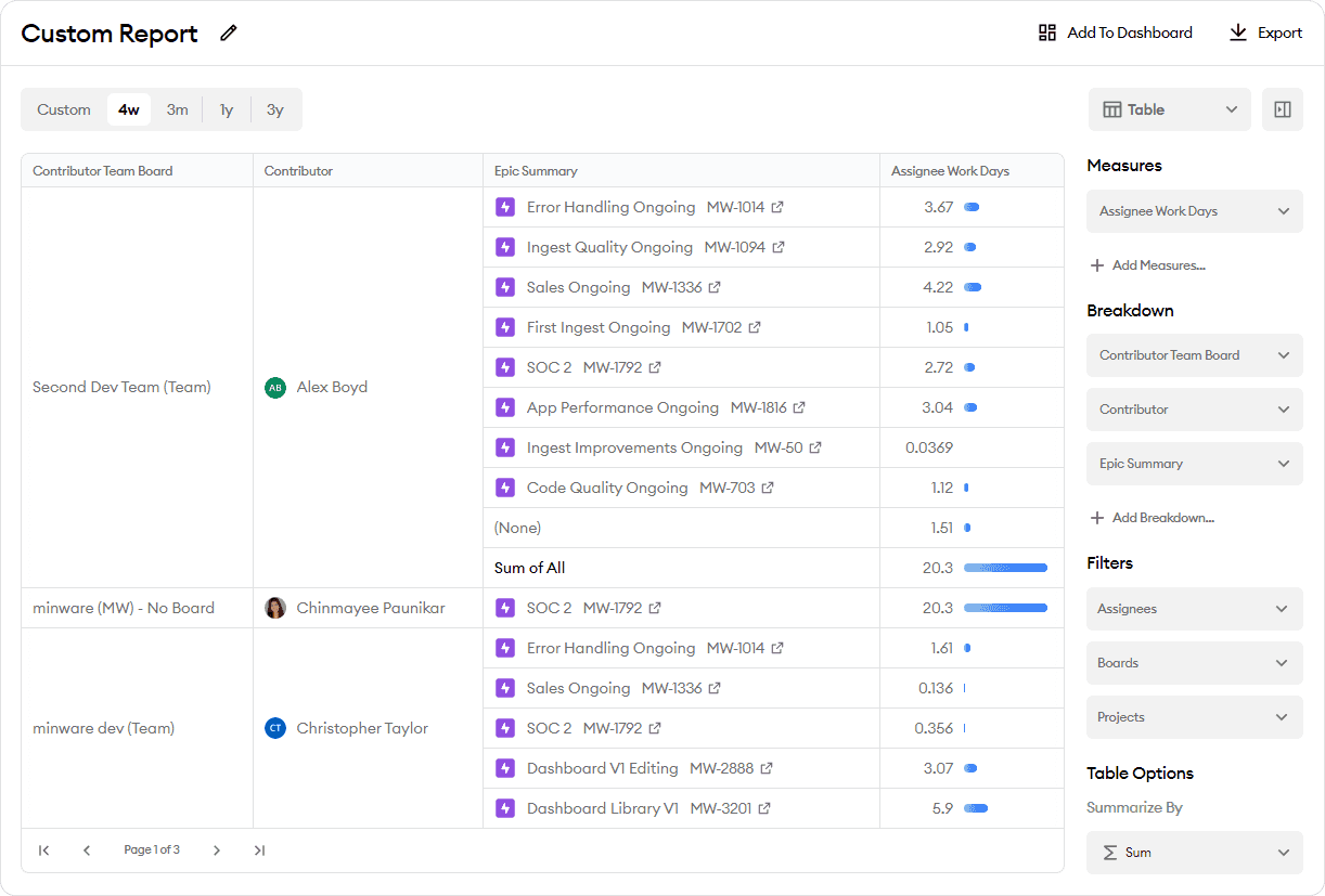
When you first arrive at the custom report builder, it will have some pre-populated options to help you get started.
Here is a screenshot of what the custom report will look like initially in minware:
Date Range Selection
You can choose any date range for the custom report. There is no limit to how far back you can go, but the maximum time range is three years.
The date range controls the time period for each of the measurements. For example, things like time spent, tickets created, or tickets completed will only cover the specified range.
For duration measurements like time from ticket creation to first commit, only intervals that end in the time range will be counted, but the measure will include their full duration. For example, a ticket created one year ago that had its first commit last week will show up with a cycle time of one year when looking at the past four weeks.
If you select a date range that ends in the past, then the custom report will display attribute values as of the end date. This includes things like ticket titles, ticket statuses, etc. So, if you select a range that ends at the end of the previous year and include ticket status, then the status that shows up will be as of Dec 31 last year, not the current status.
On the other hand, measures that include an attribute value like story points completed will use the story point field at the precise time of completion, even if it was later changed prior to the report end date.
Report Type Selection
In the upper-right corner, you can select the type of custom report. The default option is Table, and you can select from a number of other charts:
- Line
- Stacked Area
- 100% Area
- Column
- 100% Column
- Grouped Column
- Bar
- 100% Bar
- Grouped Bar
- Scatter
When switching between report types, the custom report builder will preserve all of your data selections and filters.
Report Configuration
Types of Values
There are two types of values available in the custom report configuration: attributes and measures. Attributes are properties of objects like people’s names, ticket fields, etc. These may be text, numeric, or date values.
Measures are numeric values that indicate an amount of something, like work days, ticket counts, cycle time durations, etc.
Available Values
The custom report has various values available related to people, tickets, and pull requests. For more information about the “Dev” and “Assignee” work time values, please see the time model documentation.
The other values are largely self-explanatory, but note that the “Ticket X to Y” and “PR X to Y” type values are duration measurements that look at the time between two events. These values are computed as averages, and as mentioned above, only time intervals that end within the current date range will be included.
If there is anything you’d like to see that’s not in the list, please contact us and we can add it to your minware account. We are currently able to add values based on any ticket or pull request attribute, including custom fields. We are also able to add formulas based on any available Snowflake SQL function expression of one or more values.
Adding Values
At the top of the right sidebar, you can add values to your custom report. The different sections that are available will depend on the type of report you have selected. Here are the available sections:
- X-Axis (or Y-Axis for bar charts – chart only) - Can be either a measure or attribute value. Defaults to date/time, which automatically calculates an appropriate date bucket size for the selected time range. You can only select one value.
- Measures (table only) - These are measure values that you would like to see in your table.
- Y-Axis (or X-Axis for bar charts – chart only) – These are measure values to plot on the chart’s Y-axis (or X-axis for bar charts). Each value you add will show up in its own line or bar series.
- Breakdown (All report types) – These are attribute values you can add to break down table rows or drill down into chart series. If you only have one Y-Axis value, then the chart will start out showing your first breakdown value.
All custom report types require at least one measure (table) or Y-axis (chart) value.
Value Aggregation
When you add measure values to charts, they will be aggregated by sum, with the exception of cycle time duration values, which will be aggregated by average. However, note that if you choose a stacked chart type like area or stacked bar for duration-type values, the chart display may be misleading because it will show values on top of each other that don’t logically add together. When using a duration-type measure, we recommend a line, grouped bar, or scatter chart to avoid confusion.
Removing Values
You can remove values from the right sidebar by clicking on their dropdown and selecting remove.
Drilling Down in Charts
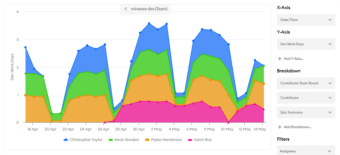
If you have added more than one breakdown value, or multiple Y-Axis values and at least one breakdown value, then you can click on lines, bar series, or points in a chart to drill down into the data on the Y axis.
When you click on a data point to drill down, the custom report will first filter out the selected Y-axis value (if there are multiple Y-axis values), and then filter values matching only the breakdown you selected. It will then breakdown the remaining values according to the next breakdown option you have added. When you reach the final breakdown value, you will not be able to drill into the data any further.
You can drill back up by clicking on the back button in the top center of the chart.
Filters
You can add filters for any non-date attribute value in the right sidebar. After selecting the attribute to filter, you can choose one or more values and apply the filter.
If you clear all values or select all values and apply the filter, it will be removed.
Parameters
Some minQL formulas contain parameters that you can override to control report behavior. If any of the report's current minQL formulas have parameters, then you will see a "Parameters" section beneath filters where you can set parameters for the current report.
Note that these parameters can also be set on a dashboard if this report is added to a dashboard, and the dashboard-level parameter settings will override report-level settings.
Chart Options
If you have a chart selected, then may have the following options depending on the number of measures and breakdowns in the report:
- Use First Y-Axis as Target - If you have multiple Y-Axis values, then setting this option to "Yes" will divide all other Y-Axis values by the first Y-Axis value and change the Y-Axis to show a percentage.
- Multi-Chart Breakdowns - This option will appear if you have breakdowns. All of the columns up to the one you select here will be used as table columns to show a table with multiple charts.
- Table Breakdown - If you set this option, then the chart will switch to showing a table instead of doing further drilldowns within the chart once you reach this breakdown value. This can be helpful if you want to include breakdowns with more detail that don't really make sense to show as a chart series, such as ticket summary.
- Min/Max Y-Axis Value - You can set min/max Y-Axis values to override the default chart range. Note that these options may not directly match the chart's Y-Axis range, which may be rounded up or down to provide spacing around the min/max values.
Other Report Configuration
For tables, you can also configure the Summarize By function. This option will display summary rows after attribute groups having more than one row to aggregate their values using standard functions like average, min, max, sum, median, etc.
Sorting
Values will currently be sorted alphabetically from A-Z by each of the successive breakdown attributes, and then by the X-Axis values (for charts).
If you would like to sort values in the table display, you can click on the headers after the data loads, which will override the default sort order in the current view.
Naming and Adding to Dashboard
You can rename your custom report by clicking on the title or the edit icon next to it. This title will be saved if you copy the URL, along with all of your current options.
You can also add your custom report to a dashboard by clicking the “Add To Dashboard” button in the upper-right corner. This will add the report with all of its options alongside other reports you’ve added to the dashboard, and also let you override the date range and certain filters from the dashboard menu.
While the custom report page will display both a chart and table for chart reports, the dashboard will only display the chart from the top of the custom report page.
Exporting Data
You can export the data in your custom report to a CSV file by clicking the “Export” button in the upper-right corner. The exported CSV file will include all of the loaded rows and original data columns, including things that aren’t shown in the report itself like user IDs. Please contact us if you need assistance with the export file format.
Limits
The custom report builder is currently limited to data sets of 50,000 rows. If the time range and breakdown values you have selected result in more than 50,000 rows, then the data will be truncated. You can work around this by narrowing the time range or reducing the breakdown values. Note that for “at end” measures like ticket count at end, narrowing the time range will have no effect and you will need to reduce the breakdown values.
If you select a breakdown value that has more than 100 unique values when applied, any values beyond 100 will be grouped together as “Other”, and you will not be able to drill into that group.

